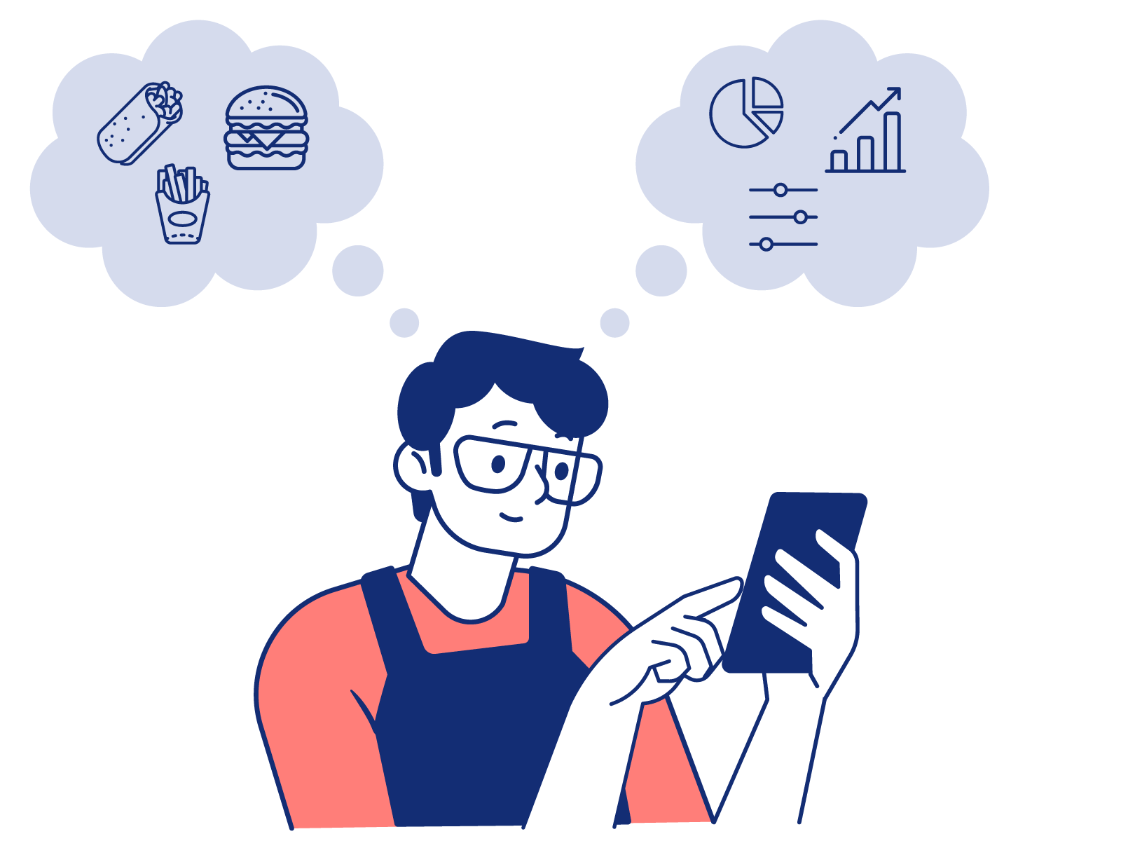
Easily Sync Your Restaurant's Forecast Data Across Systems with New API
Crunchtime's new Sales Forecasting API helps customers easily move their forecasting data across systems without disruption.
Read more
The Crunchtime dashboard is now redesigned to help restaurant professionals interpret data faster and make smarter decisions.
We recently rebuilt the dashboard for Crunchtime’s Inventory Management and Labor & Scheduling platforms in version 11 to prioritize data visualization. This article explains why it is important for restaurants to have easy access to data and how Crunchtime approached the process to improve the dashboard experience for restaurant operators.
It was time to redesign the Crunchtime dashboard
The Crunchtime dashboard, also known as the Net-Chef dashboard, is home to all of the critical metrics and KPIs for managing inventory and labor. These metrics includes weekly sales, food costs, labor summaries, waste trends and much more.
As the command center for the back-of-house, dashboard information should be displayed in an easy-to-interpret format for restaurant professionals. There is little time to waste in a fast-paced restaurant environment—managers need to understand data in real-time and act on insights quickly. Studies show that 90% of the information transmitted to the brain is visual. If our brains value visuals over all other types of information, it only made sense that the Crunchtime dashboard prioritized data visualization.
Moving away from a text-heavy dashboard was the best way to help restaurant operators understand their data quickly and draw conclusions about important metrics and KPIs for profitability.
Designing a dashboard for better decision-making in restaurants
Crunchtime’s new dashboard is designed to improve data visualization, and help restaurant professionals bridge the gap between data and decisions. Information like inventory stock levels, menu profitability, sales forecasts, and daily operational tasks are now more accessible for your restaurant teams.
The dashboard utilizes color and different visual elements like bar charts and line graphs to make the data easy to understand and interpret at a glance. By minimizing the use of text and leveraging the power of data visualization, restaurant operators can now quickly see trends and identify outliers. Drag and drop widgets make the dashboard fully customizable and allow users to prioritize the information that is most important for their daily operations.
The development was a collaborative process from design to delivery that involved internal teams, customers and other stakeholders. Both Anna Sergeychik, Senior Director of Engineering and Katie Barriga, Product Manager, played important roles in the development process.
 |
 |
| Anna Sergeychik Senior Director of Engineering Crunchtime |
Katie Barriga Product Manager Crunchtime |
Here’s what they had to say about the process:
Question: What prompted the design of the new dashboard?
AS: The dashboard is the center of operations for restaurants. Crunchtime’s original dashboard was created in 2014 and over the years, we have continuously listened to customers and collected information on ways to improve the dashboard experience.
While many of these ideas were already incorporated into the product, some ideas required more technological advancements to reach the level we were striving for. In 2020, we introduced a new technology in the Crunchtime product that opened the door to more possibilities from a development perspective. Shortly after, we decided to revise the existing dashboard to incorporate this new technology and introduce best UX practices with a full redesign.
Question: Can you describe your approach and process to redesigning the dashboard?
AS: Our team prioritized these 3 key areas in the dashboard redesign:
We began working on these changes and we collected feedback from external and internal stakeholders. Next, we analyzed how customers were using the widgets. The widgets display all of the relevant information, data, and controls on the dashboard that users need to see every day, so it was critical that they were designed with intention.
Each widget has a specific purpose and needs to clearly convey information for the user, whether it's labor costs, menu profitability, waste management, or the daily to-do list. We took a collaborative approach and continued leaning into feedback from internal and external stakeholders to understand exactly what dashboard improvements were needed in order to maximize users’ productivity. Of course, there were many other steps, but the new dashboard is the result of this work.
Question: How did you test the new dashboard design?
KB: During the iterations of the design for our new dashboard we continued to collaborate with internal and external stakeholders and collect their feedback on what we already accomplished and what we were planning to build next.
We closely monitored feedback and if we saw a strong signal to pivot, we would change our direction accordingly. For instance, when we rolled out a new color schema, customers could choose between multiple color themes. Eventually, we saw that customers were transitioning to the new color theme, so we decided to sunset the old theme.
Along the way, we continuously sought out feedback from customers and we adjusted the design accordingly. Once the design was complete, customers were invited to test the new dashboard in beta and provide their feedback. Through in-app messaging, customers in beta could review their experience directly from the dashboard.
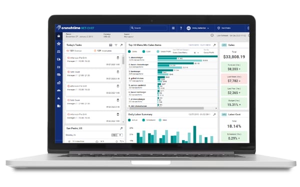
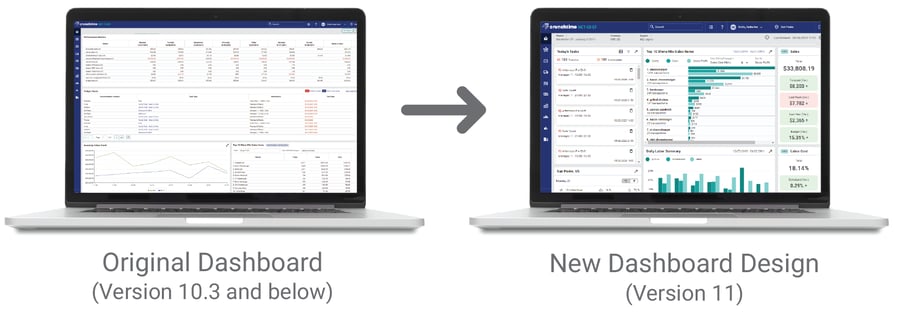
Pictured Above: The updated Crunchtime dashboard, now available for users on version 11.
Question: What's Next?
KB: At Crunchtime, we know that restaurant operations are dynamic, and your dashboard should be too. We value our customers' feedback and we will continue to provide useful features and enhancements that meet the current and future needs of restaurant operators.
Question: How can Crunchtime users access the new dashboard?
KB: All users who upgrade to version 11 of Crunchtime's Inventory Management or Labor & Scheduling platforms will have access to the new dashboard.
If you are a customer currently using the new dashboard in version 11, we’d love to hear from you— reach out to your customer success manager today to tell us what you enjoy, or what you would like to see improved in the dashboard.
Ready to learn more about Crunchtime?
Find out how Crunchtime's restaurant management software can optimize your operations — reach out to us today for a customized demo.